Unique technical conditions of journalism on battlefield
The 33 issues were printed in makeshift underground or cave-based field print shops. Equipment included small, hand-operated typographic presses; limited and incomplete lead type that had to be recast or supplemented; small paper sizes (often A3) of poor quality; and single-color ink prone to smudging. Gas mantle and flashlight are the only sources of lighting. These constraints shaped a layout style that was simple, compact, clear, and extremely economical in the use of characters, with minimal large text blocks.
Printing typically took place overnight so the newspapers could reach units by dawn. Page layout, therefore, had to be fast yet precise, with minimal morasse corrections, optimized use of printing forms, and repeated layout templates across issues to save time.
    |
 |
|
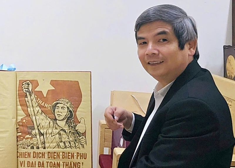
The author is deeply impressed by the trench-style illustration of the 33 issues of PAN published on the Dien Bien Phu Front. |
Only five people were responsible for producing all 33 issues. They simultaneously handled writing, editing, layout, typesetting, printing, and distribution. This multi-functional workload gave the newspaper a modest but highly effective design style, one that embodied the spirit of the “soldier–journalists.”
Flexible newspaper layout in battlefield conditions
Each of the 33 issues contained only two to four pages. The small format allowed faster printing, easier transport, and greater convenience for readers in combat conditions. Because of this small paper size, page layouts had to be clear, with strong separation between sections and concise, prominent headlines.
The front page of every issue was treated as an “information battlefield.” Its structure remained largely fixed. The PAN manchette appeared at the top in a simple yet sturdy typeface. The main headline, usually a victory report or a directive from the campaign command, was set in large type. One or two short articles provided direct updates on the developments on the battlefield. Additional small sections highlighted exemplary combat actions, motivational messages, or important notices, all presented with care. This consistent front-page layout created a rhythmic visual identity throughout the campaign; each issue functioned as a “combat bulletin” that boosted troop morale before a battle.
The inner pages varied widely from issue to issue. Pages two through four typically carried quick frontline reports, messages from the rear, political education pieces, morale-building articles, and short military training notes or combat tips. Because of paper-size limitations, each page generally contained only two to three columns, each relatively wide to avoid overly dense text.
Design principles emphasized conserving “space” while keeping type large enough to read. Articles were kept brief, and layout incorporated intentional “breathing spaces” to make the paper easier to read. Poor-quality newsprint and easily smudged ink required careful techniques: headlines were set in moderately large type and limited to no more than two lines; text was concise and typesetting avoided crowding; line spacing was adjusted to prevent ink bleed. These “breathing spaces” not only reduced printing errors and improved clarity, but also helped create a readable rhythm for soldiers who often read under dim light.
Art of typesetting under severe conditions
Because only a few sets of lead type were available on the battlefield, typesetters had to work creatively with whatever sizes they had. Missing characters had to be mixed, substituted, rotated, shimmed, or recast. Long headlines were avoided to conserve type. These limitations shaped a style of headlines that were short, forceful, compressed, and infused with a strong fighting spirit.
Without professional typesetting or layout tools, every line in the 33 issues was set manually, aligned by eye using wooden frames and rulers. Despite the rudimentary process, the resulting pages appeared straight without feeling rigid; columns sometimes leaned slightly, but this lent an authentic, lived-in quality that evoked the raw, emotional atmosphere of the battlefield.
The typefaces used throughout the issues were simple but highly effective. Most text employed thick-stroked sans-serif type, which was easy to read in low-light conditions. This “forced minimalism” inadvertently produced a modern visual character, reminiscent of many military newspapers around the world at that time.
Unique trench-style illustrations
Because of printing limitations, the 33 issues could not include photographs. Instead, they featured illustrations, few in number but of exceptional value. These were sketches created directly on the battlefield by soldier-journalists-artists, drawn in charcoal, pencil, or Chinese ink, then converted into printing blocks. The drawings had a raw, expressive quality, with bold lines that conveyed immediate emotion and reproduced well in typographic printing.
Most illustrations depicted battle diagrams or the directions of troops’ assaults, rendered as entirely hand-crafted infographics. Many issues included visual diagrams of deep-penetration maneuvers, attack plans for A1 and C1 Hills, or maps of French positions. Though simple and stripped down, these hand-drawn visuals carried extremely high informational value. They represent some of the earliest military infographics in Vietnamese journalism. Each illustration was composed with deliberate strokes and solid shapes, with virtually no superfluous detail.
Every line served a purpose, enhancing visual engagement, aiding the communication of battlefield information, and reducing the sense of text heaviness across the pages. The result was a unified aesthetic: simple, condensed, and forceful.
Monochrome, yet full of “voice”
All 33 issues were essentially printed in black and white. Only a few mastheads and large illustrated inserts (full-page spreads) used limited spot colors, at most three: black, red, and yellow. Even so, through careful typesetting and deliberate ink–paper contrast, each issue achieved visual emphasis.
Main headlines were printed in bold, larger type, functioning as the page’s primary “color” accent to draw the reader’s attention. Secondary headlines, set in moderate sizes and regular type, were spaced more loosely, forming a lighter background that created tonal balance across the page. The battlefield sketches, with their clear, alternating thick and thin lines, were sometimes accompanied by heavy black or red areas, while touches of yellow added focal points that guided readers to key visual moments.
This minimalism in color created a harmonious and solemn aesthetic style and unmistakably imbued with the “spirit of the military,” perfectly suited to a wartime newspaper.
Design deeply rooted in military journalism
The 33 issues embodied a design ethos that was straightforward, direct, and powerful. The foremost goal of layout of issues was clarity: easy to read, easy to understand, easy to remember, easy to act upon, and capable of inspiring soldiers.
The content of all 33 issues centered on combat information. Every article served the common political and military mission. Even so, the newspaper still included small entertainment or satirical sections. Its presentation style therefore prioritized focus, with no scattering or meandering, and maintained a strong, uplifting tone that bolstered troops' morale.
These issues reflected the close bond between soldiers, journalism, and the frontline. Their layout was approachable and practical, tailored to readers who were soldiers reading quickly during short breaks, in underground shelters, or while on the march. This was designed as a tool for combat, a distinctive philosophy of military journalism.
Historical value and significance for modern press design
The 33 issues are not only a valuable legacy of journalistic history but also a testament to wartime design and printing under extreme conditions. They demonstrated the creativity of Vietnamese journalists in general and soldier-journalists in particular, as well as their ability to apply technical and artistic solutions despite severe material limitations.
The issues offer enduring lessons for the profession: prioritizing information over decorative complexity; using minimalism to enhance visual effectiveness; employing illustrations and infographics as strategic tools even without advanced technology; and building identity through spirit as much as technique.
These publications have become important visual materials for teaching design, layout, illustration, and media aesthetics. They exemplify the multi-skilled reporter–editor model and serve as a classic case study in wartime journalism and communication under extraordinary circumstances.
In the history of Vietnamese press design, few bodies of work are as distinctive in content, form, production context, and symbolic value as the 33 issues of the PAN published on the Dien Bien Phu Front. They are not merely journalistic documents, they are part of the Dien Bien Phu memory, recalling “a heroic people, a heroic military, and a heroic press.”
Assoc. Prof., Dr. Ha Huy Phuong, Academy of Journalism and Communication
Translated by Tran Hoai